
When one thinks of Manuscript Pens, you think of cheap calligraphy sets, a love of the colour black and annoying plastic packaging that only the devil himself could open.
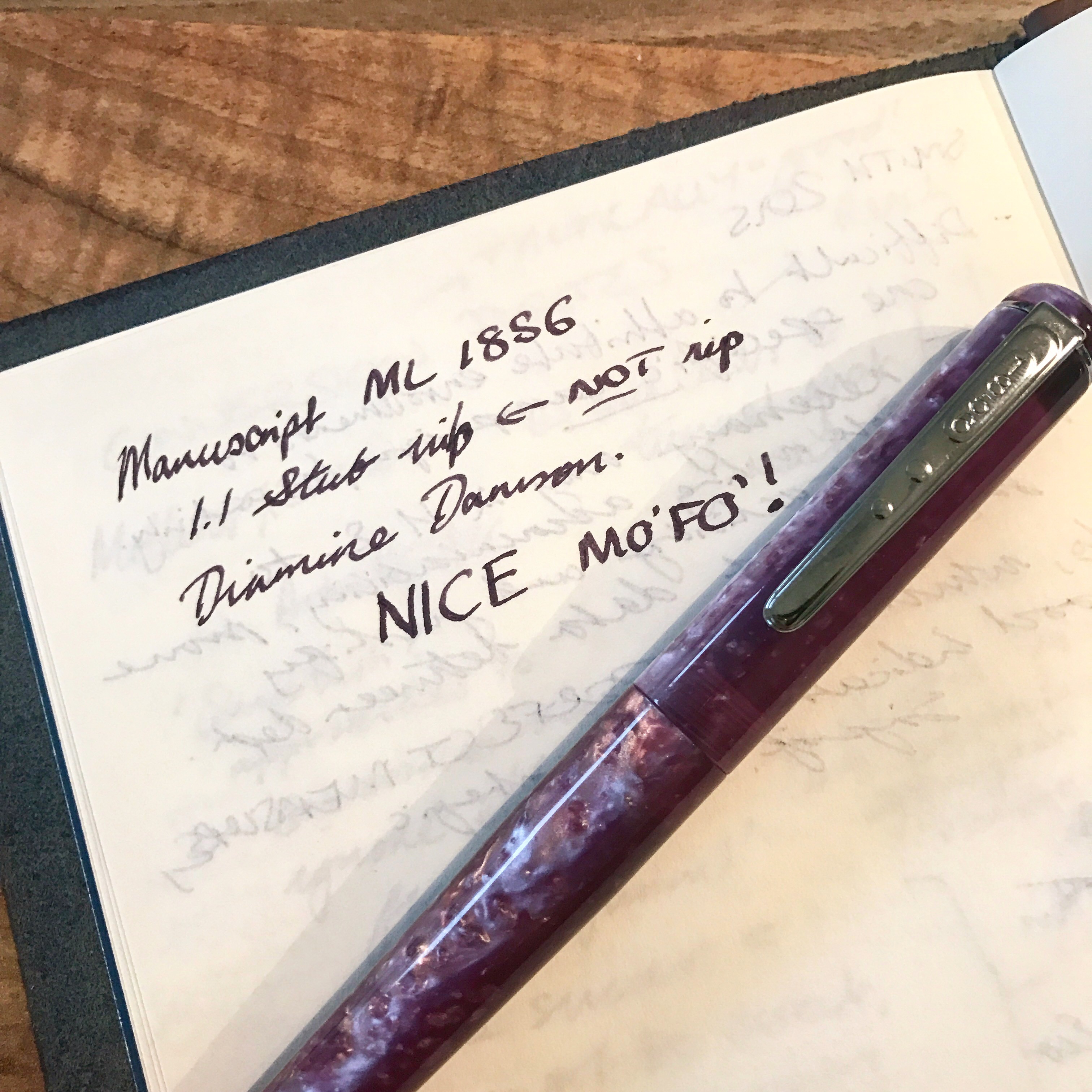
BUT, the lovelies at Manuscript have come up with a new, high end and – thank god – non-plastically packaged older brother: the Manuscript ML 1856. It was much adored at the London Stationery Show and flaunted about on Instagram; my brethren at the United Inkdom were lucky enough to get review units, and I drew the long straw to test out a ‘Purple Mist’ (not rain, unfortunately) version with a 1.1mm stub. SCORE!
Here’s how we got on.
The Vital Statistics
- Made of Italian Resin
- Available in Oyster; Red Storm; Midnight; Molten Lava; Northern Lights; Turquoise Ocean and Purple Mist
- Comes with either a M, 1.1mm or 1.5mm stub nib, all steel. Single and two tone options available
- Package comes with a cartridge converter and short international cartridge
- Will retail for c.£125 – not yet available
- 13.9cm long, cap 6.5cm, top of cap diameter 1.3cm, bottom of barrel diameter 1cm, section 2.7cm long
- Steel clip and steel Manuscript logo inlay on top of cap
Not a bad looking customer at all! My main and initial gripe is with the clip – it feels cheap whilst the rest of the pen looks classy. It is stamped with the 1856 logo with two weird bobbles on. No embellishments or Visconti-esque flourishes here.
It looks like something a 14 year old has stamped out in woodworking class. You don’t dress a supermodel in a Primark dress for god’s sake.
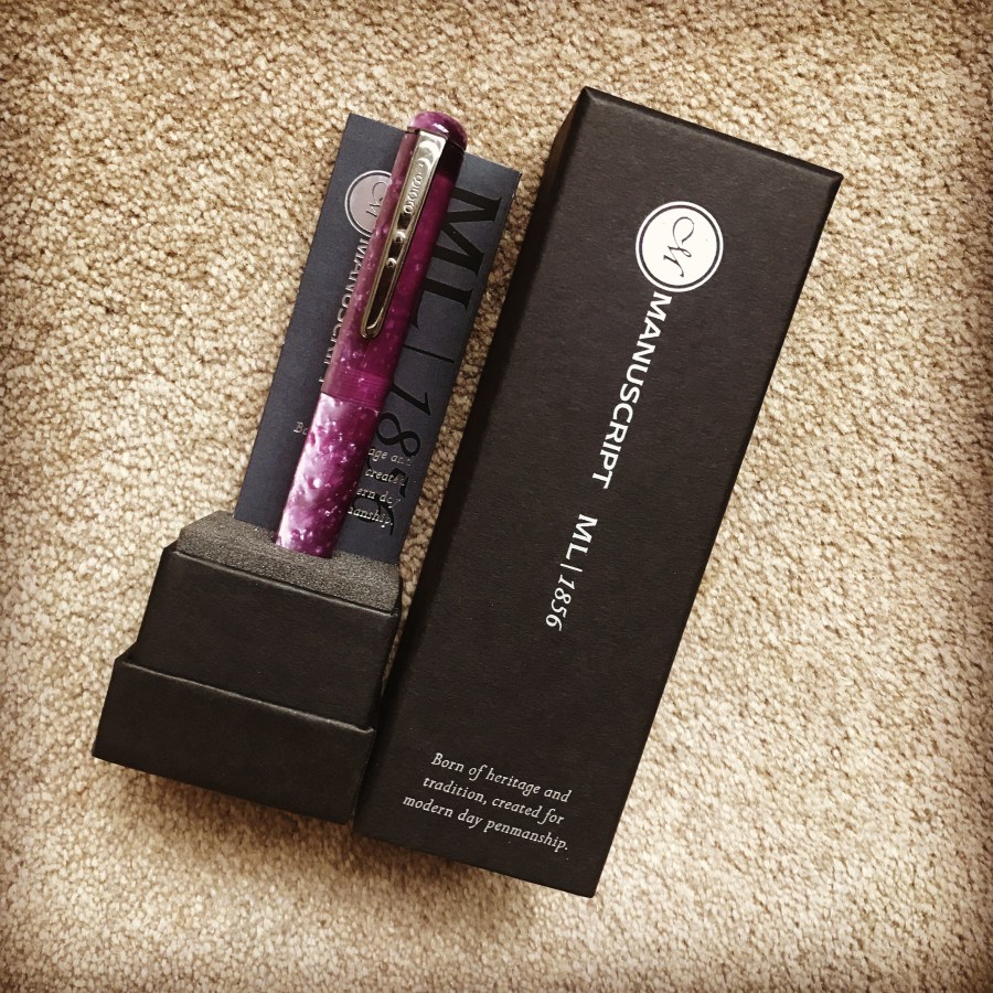
The Packaging
The packaging looks like it belongs in The Matrix – awesome!
It is a simple black cuboid with silver leaf writing, which pulls off to reveal the pen and the usual pen gumf (history I assume), that hides what you are really looking for – the cartridge converter. It looks classy, mysterious and had me interested from the word go. It also (probably more importantly), houses the pen well.
Good work on the ‘looking fly’ so far.
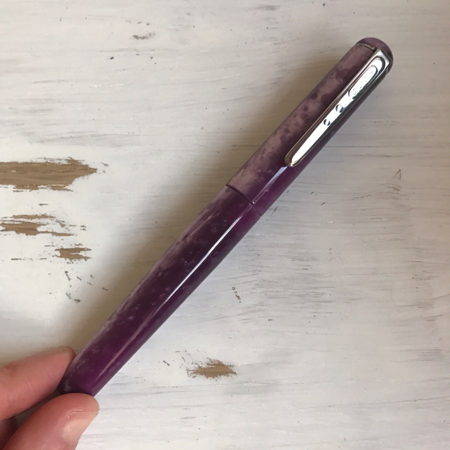
The Pen Body
Like Emma Stone’s eyes, I could get lost looking into this gorgeous Italian resin. It glitters at every angle, has stunning silver flecks in it and wonderful chatoyance. (Look at me using big words!). It reminds me of the Edison Pearlette or Collier, but I think the Edison resins have greater depth to them, and pip the Manuscript to the post when looks are concerned.
The body feels smoother than a baby’s bottom to touch too, if that is a must for you.
The body tapers towards the end, so much so that I assumed it was so the cap could post. Alas, it does not, it just holds on to the end for dear life waiting to be flung across a classroom/desk/romantic picnic ensemble. That said, it is easily used unposted, especially if you have tiny gnome hands like me. The section is also tapered, with a flare at the nib end to rest your fingers on whilst writing. I hold my pen quite near the nib, so this made it a comfortable writing experience for me.
The cap unposts in a respectable 1.5 turns, with some of the smoothest threads I have used on any pen and gave me an irrational sense of joy when uncapping. There is something about a smooth action that drives me wild…
For pen looks then it is a blinder, although my Edison Collier still remains my number one.

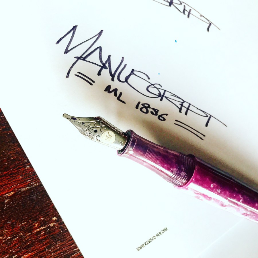
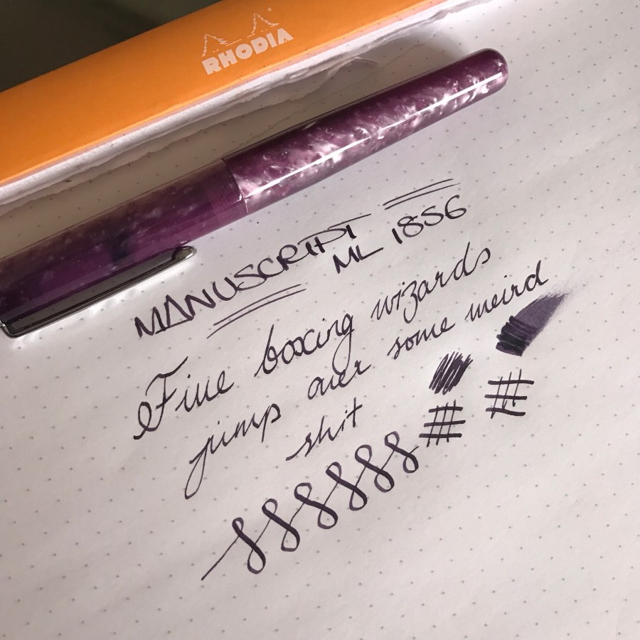
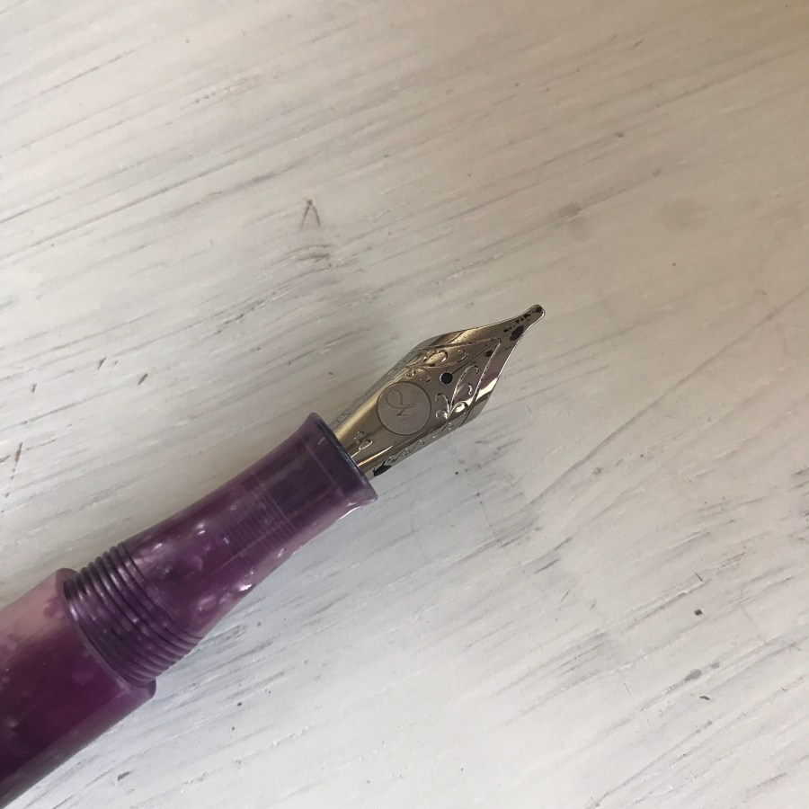
The Nib
It’s a standard JoWo affair here. It is a juicy 1.1mm steel stub, that writes wetter than an Autumn Sunday in England (that’s ‘fall’ to my American readers). It has some wicked variation, lays down a dark line and I loved writing with it. It has a touch of feedback that won’t be for everyone, and it certainly isn’t for every day writing, but I’ve used it for headers, angry notes and general pissing about. What all things should be used for in my opinion.
As an aside, the scrollwork on the nib is prettier than dancing unicorns too.
The Verdict
In the words of Borat: ‘it’ss NIIIiiiIIICCCEEE’. I like the ML 1856 a lot. It is British (we don’t get enough British pens), is aesthetically HOT and writes well.
BUT…
…the Americans do it better. The Edison Collier or Pearlette which retail for a similar price just feel better quality and more of a ‘grail’ pen to me.
So, I guess I like the Manuscript, I just don’t love it. A typical case of ‘it’s not you, it’s me’.
What do you think of the Manuscript ML 1856?
Keep those nibs mucky!
Disclaimer: This pen was provided free of charge for review. This in no way influences my opinions or ability to compare it to unicorns.

Is Italian resin less precious than precious resin, or is it more precious due to “la dolce vita”?
As for Americans doing it better, I was going to make a Brexit joke, but then Trump.
Excellent review, as always.
LikeLiked by 2 people
Haha excellent comment, as always ;)!
LikeLike
Great review as always . I do feel the clip looks a bit cheap and not very substantial. As for the pen reminds me of a Conklin but at £70+ more . I do like the resin though .
LikeLiked by 1 person
This looks so much like the Delta Fusion 82 purple (or fuchsia if you must)! Thanks for the review, very thorough.
LikeLiked by 1 person
Great review, but oh boy that clip looks awful – Unless they sort that abomination out & come up with something that justifies the price, they’re isn’t a hope in hell I’ll buy it !
LikeLiked by 1 person
Hey mark! Got your email – I can’t amend comments but I will on your behalf say *there :)!
LikeLike
[…] Laura’s review of the Purple Mist […]
LikeLiked by 1 person