
Before we start proper, I want to say a massive HAPPY NATIONAL STATIONERY WEEK! Finally, seven days for pen, paper and pencil nerds to unite! To commemorate this wonderful event, expect to see some more unusual posts this week (and perhaps a giveaway, if you are nice to me), to represent the wide array of stationery loveliness out there!
So I don’t have a fancy camera. I don’t have ink swabs. Nor do I have the patience of a saint. BUT I do use pens a lot and enjoy inky fingers.
Here is my first attempt at an ink review where I hope enthusiasm makes up for my lack of technical skill. I mean who really cares about what bleach will remove the ink, for example?!
Lots of hugs and kisses to Pure Pens for sending out some samples for me to enjoy! And big love to Scribble at United Inkdom for sorting it all out; look out for a meta review real soon!
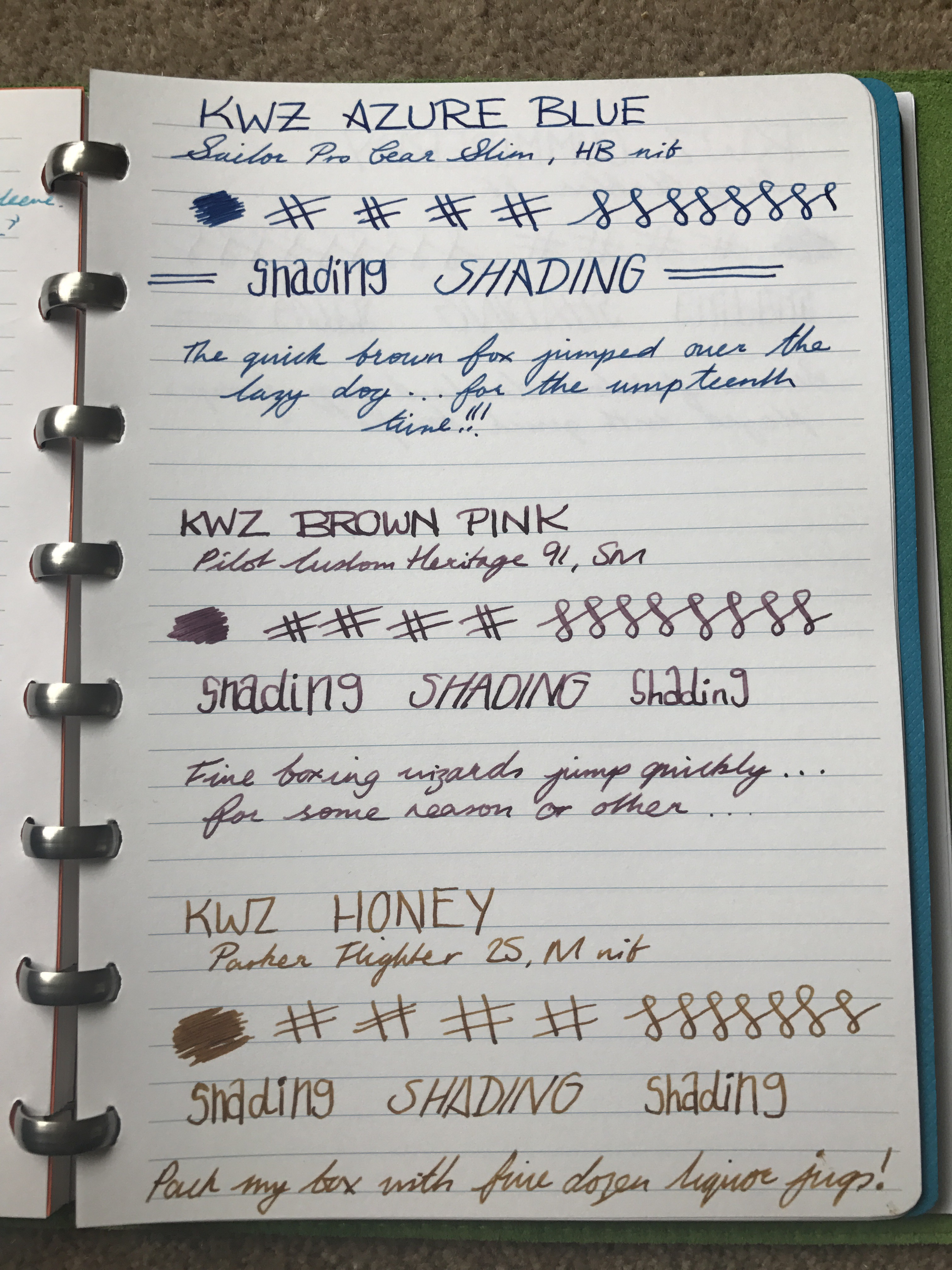
Cool Customer: Azure Blue #5
Like Robert Oster Fire and Ice, but not mad keen on the red sheen? Then KWZ Azure Blue is for you. It’s a gorgeous deep blue, very lubricated and offers some wonderful shading. It pairs beautifully with my Sailor Pro Gear Slim – it actually makes the nib less feedbacky (yes that is a word!) – and is an ideal everyday writer. My only complaint is that it is Mr Boring, but we all need a go-to blue in our arsenal don’t we?
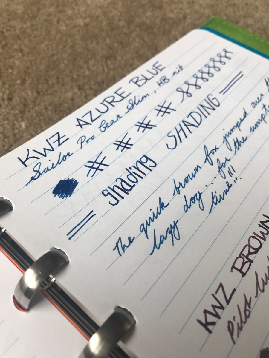
Hot Potato, Sweet Potato: Brown Pink
I’ve lusted after Sailor Bung Box Sweet Potato for a long time now. But my wallet and sanity when facing obscene customs charges, just couldn’t take it. Thank the lord for KWZ Brown Pink, which exhibits the same colour(ish), beautiful shading and a mild silver sheen. It looks SEXUAL in a flex nib, has a colour somewhere between beetroot and cabbage (not the same smell though thankfully), and was my favourite of the four on test. My new bezzie when it comes to inks!
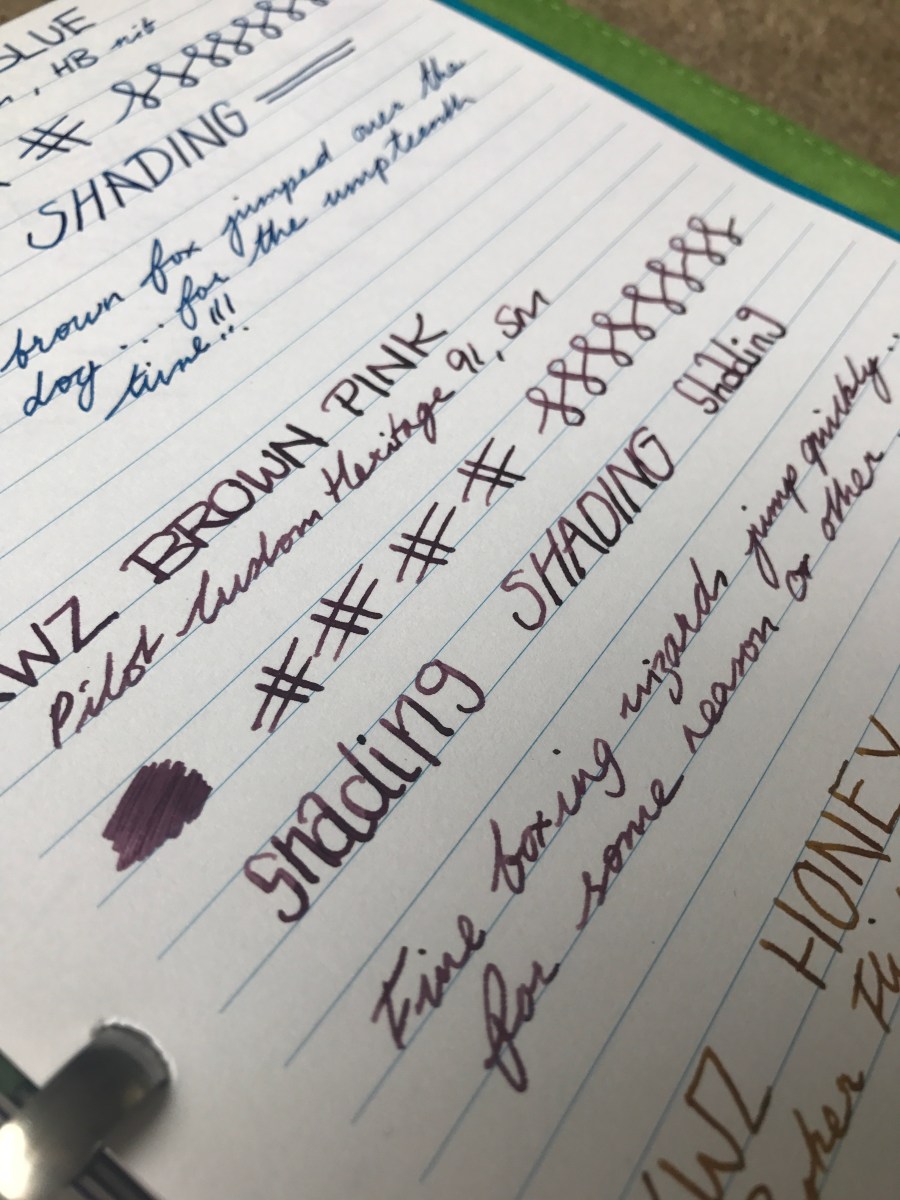
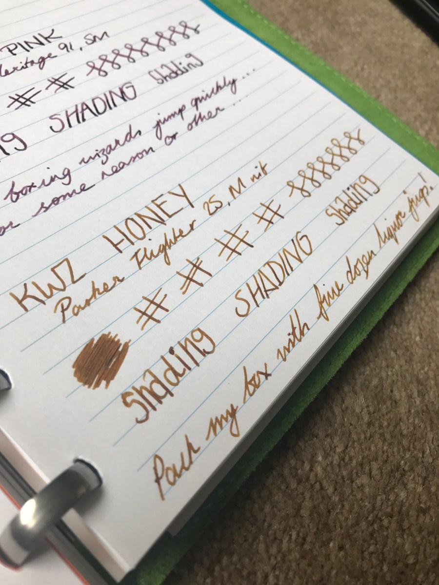
Honey, I’m Home: Honey
In the words of Oasis, the community went ‘MAD FER IT’ when KWZ Honey first came out. I kinda get it; it is a vibrant, antique gold with lovely shading and manages to be a hue that could be used for everyday writing. BUT, for me it was a bit ‘meh’. It can look like a dirty brown, I didn’t get the same wow factor that I did from the Brown Pink, and for a darker browny gold I prefer Diamine Ancient Copper. The KWZ is also wetter than an otter’s pocket so lefties, beware!
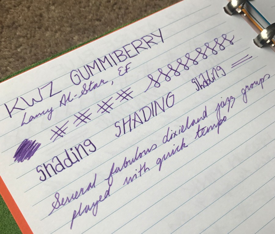
Yummy Jelly Baby: Gummiberry
I’m not a fan of unicorns, cats or girly colours, so I was genuinely shocked that I liked Gummiberry as a colour. It is a sickly sweet violet/lilac that pops off the page, and wasn’t as wet as its other KWZ brothers. I inked it up in an EF nib, so I imagine in a broad or flex nib it would be even more crazy and a decent shader. A perfect highlighter or header colour or – if you are anything like me – for leaving passive aggressive post it notes to your loved ones on the fridge.
Final Verdict
I hadn’t used KWZ inks before, and I’m in LOVE with how wet they are. They have transformed a toothy Sailor nib into a pen I want to keep rather than sell, and the colours are so vivacious that you can’t help but love them! I’m over KWZ Honey, and Azure isn’t that exciting, but Brown Pink and Gummiberry have found their way into my regular rotation. So if you like lubricated unicorns, you’ll love these ;)!
Have you tried KWZ inks? What is your favourite colour?
Keep those nibs mucky!

Grey Plum, Green Gold #2 and El Paso are my current top 3 🙂
LikeLiked by 1 person
El Dorado! Lol, not El Paso…
LikeLiked by 1 person
Definitely like the look of brown pink. Feeling dubious about gummiberry, so I’ll get a sample and see if that changes my mind.
(You do make me laugh 🙂
LikeLiked by 1 person
Honestly I thought the same Jo about Gummiberry, but on paper it’s pretty lovely! Let me know how you get on 😉
LikeLike
I tend to go for purples or blues, but I quite like all of these colours 🙂
LikeLiked by 1 person
Brown Pink, for me!
LikeLiked by 1 person